So, you’ve got a website, but it’s not quite bringing in the bookings you’d hoped for? Here’s the thing: not all websites are created equal! A great website can make a huge difference in attracting guests and getting those direct bookings rolling in. But if tech isn’t your thing and you’re strapped for time, how do you make your website work harder for you? Read expert tips on how to get direct bookings for your accommodation rolling in with these simple tips.
Peter Fabricius, website pro and co-founder of Springnest (the official website partner to NightsBridge) says, “While websites offer multiple benefits, spending your time prioritising the channel driving bookings without third-party commissions should be your focus.”
Here’s Peter’s plan to get those direct bookings flowing:
The quick website health check.

The path to a high-converting, revenue-driving website is much shorter than you think. According to Peter, these are the top three items to put on your to-do list.
Priority #1: Do a ruthless homepage audit.
“Put yourself in the shoes of your guests and bookers,” Peter advises. “Try to be as objective as possible when going to your own homepage.” He wants you to analyse those first images and lines of copy as if you are a total stranger who just landed there.
Peter’s test is simple: “Is your website saying what you offer, where you are, and why someone should book with you?” If not, it’s time for a rework. If those opening visuals and messaging don’t instantly sell it, change them up.
Peter’s top tip: “Ensure your booking button and widget are prominently displayed and working correctly. We see more people using the booking widget than they do the main ‘book now’ button, so add this if you haven’t already.”
Priority #2: Cut site leaks.
According to Peter, too many properties are unknowingly shuttling potential guests off their websites through leaky link syndrome. His tip? “Go check the number of links that take people away from your website – social media icons, third-party badges, activity links, etc.”
Do a full audit, scrutinising every link: “Showing a TripAdvisor award can build confidence. But ask yourself — is this worth potentially losing the booking over?” If not, those leaks better get capped and stemmed.
Priority #3: Gallery glow-up.
Peter says visuals are everything: “We see gallery pages being among the top viewed before booking.” In other words, your photo gallery is your website’s most important space for making a first impression. His audit process is simple but highly effective: “Look at the first images someone sees before scrolling. Are these your absolute best, most enticing photos that would convince someone at a glance?” If not, do a quick rearrange and swap out – remember, quality over quantity moves the meter.
The Mobile-first mandate.
With mobile traffic and bookings only continuing to skyrocket, Peter warns property owners against slacking on this: “It’s not enough for a website to just be ‘responsive’ on mobile. You must also ensure it functions flawlessly – date pickers and calendars are critical.”
His advice? Do a mobile usability test yourself. Pull up your site on multiple phones and tablets, clicking through every button, function, and booking step along the way. “At Springnest, we rigorously test websites across devices because over 50% of bookings happen on mobile now. Getting it right directly impacts revenue.” No excuses – a buttery mobile booking experience is non-negotiable if you want to stay competitive.
Build customer catalysts.
But even with the flashiest website, Peter warns it’ll fall flat without a focus on your most valuable guest personas. That’s why he has another game-changing tip: develop detailed profiles for your most lucrative guest types. “Anything you do – social posts, promotions, updating the homepage – will be more effective if you deeply understand who you’re speaking to,” he says.
His persona-building advice is simple: “Get input from your front desk staff on common guest types and psychographics. Building relatable personas stops you from making assumptions.” Taking just an hour to map out 2-3 key segments could be a revelation for driving more direct bookings.
Irresistible offers + pop-ups = profit.
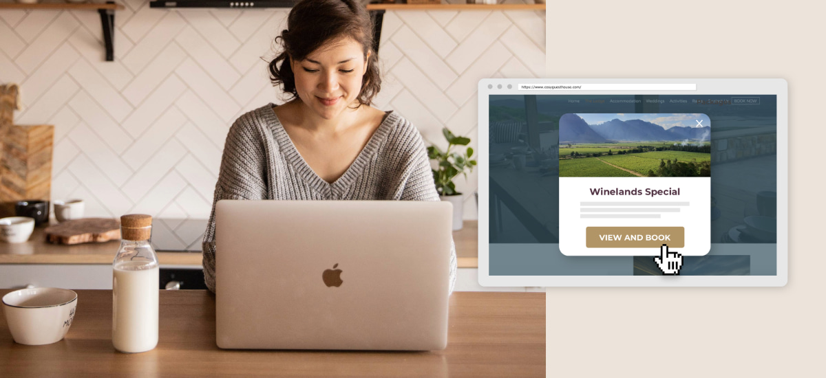
Last but not least, Peter’s team has found pop-up promotions to be a massive conversion booster for properties when used wisely and tactfully: “Pop-ups are the only way to guarantee someone sees your message. But there’s a fine line between prominent and intrusive.”
He advises using Springnest’s pop-up tool and setting strict rules: “Only show once per visitor session, and consider discounts over value-adds if you really want to move numbers quickly.”
He recommends browsing other hotel and online travel agency (OTA) websites for pop-up promotion inspiration to get started. See what offers and designs grab your attention. Short copy, straightforward discounts, and eye-catching visuals usually work best.
Need a website?

Not sure you need one? Travellers often use OTAs as search engines, and then shop around for better deals. Having a website allows you to capitalise on this behaviour, as guests are more likely to book directly with you if they can find your website.
Springnest is a website partner solution that integrates with NightsBridge, allowing you to launch a professional website quickly and easily. The integration includes a ‘book now’ button and a booking widget, making it easy for guests to book directly with you. The integration between NightsBridge and Springnest speeds up the process by taking a lot of the work away from the property, making it really fast to get a professional website up and running. Find out more here.
For more tips on how to increase direct online bookings, download the NightsBridge Direct Booking Guide here.


